
EdTech, AI-driven teacher dashboard plus student game
Role: Product Designer Intern
Timeline: 6 months
Tools: Figma, Google Sheets, Asana, prototyping, Product strategy, UX research, interface design
Type: Mobile, Tablet, Web UX Design





I worked on RightOn! two halves: MicroCoach, a teacher dashboard RightOn Play, the live math classroom quiz.
MicroCoach
Building the visual loop, from sketch to system ࣪ ˖⏱ ˚.
MicroCoach is the tool I co-built to close that gap, an AI-driven dashboard that reads a class's quiz results through a knowledge graph and turns them into clear next steps for the teacher.
The Problem ࣪ ˖⏱ ˚.
A teacher gets a stack of graded quizzes back and has to guess what to do next. The grade tells you who got a question wrong, not why, and not what to try tomorrow. Existing tools are good at collecting and scoring, none of them turn that data into a specific next step.
How might a teacher move from "who got this wrong" to "what do I do about it," without adding another hour of manual review to their week?
Where Everyone Else Stops ࣪ ˖⏱ ˚.
To sharpen MicroCoach's value proposition, feature parity and gaps were tracked against the competitive set above. The pattern across competitors: strong upload and grading utility, but shallow instructional guidance after grading was done.

Landing. I sketched this: a welcome screen with a simple promise, "Your students have the answer, MicroCoach helps find them."

A/B Testing. Two directions, tested side by side.

From there, wireframe B, the version I developed, grew into the product's core loop, Assess, Understand, Plan, Reflect, so a teacher always knows where they are.
Getting Teachers In the Door ࣪ ꗃ₊˚
Once a teacher decides to try MicroCoach, login has to work for both a first-time sign-up and a returning teacher picking up mid-cycle, while upload has to turn a stack of graded quizzes into something the dashboard could actually read.
Upload. I sketched this from a real use case: a math teacher arrives from the landing page's "Upload Assignment" card with two files sitting on their desktop, an assessment matrix and a Week 27 COACH doc, and just needs to hand both to MicroCoach and get out.

A/B Testing. Two directions, tested side by side.


From there, wireframe B, the version I developed, grew into the product's upload flow.
From a Grade to a Next Step ✎ᝰ
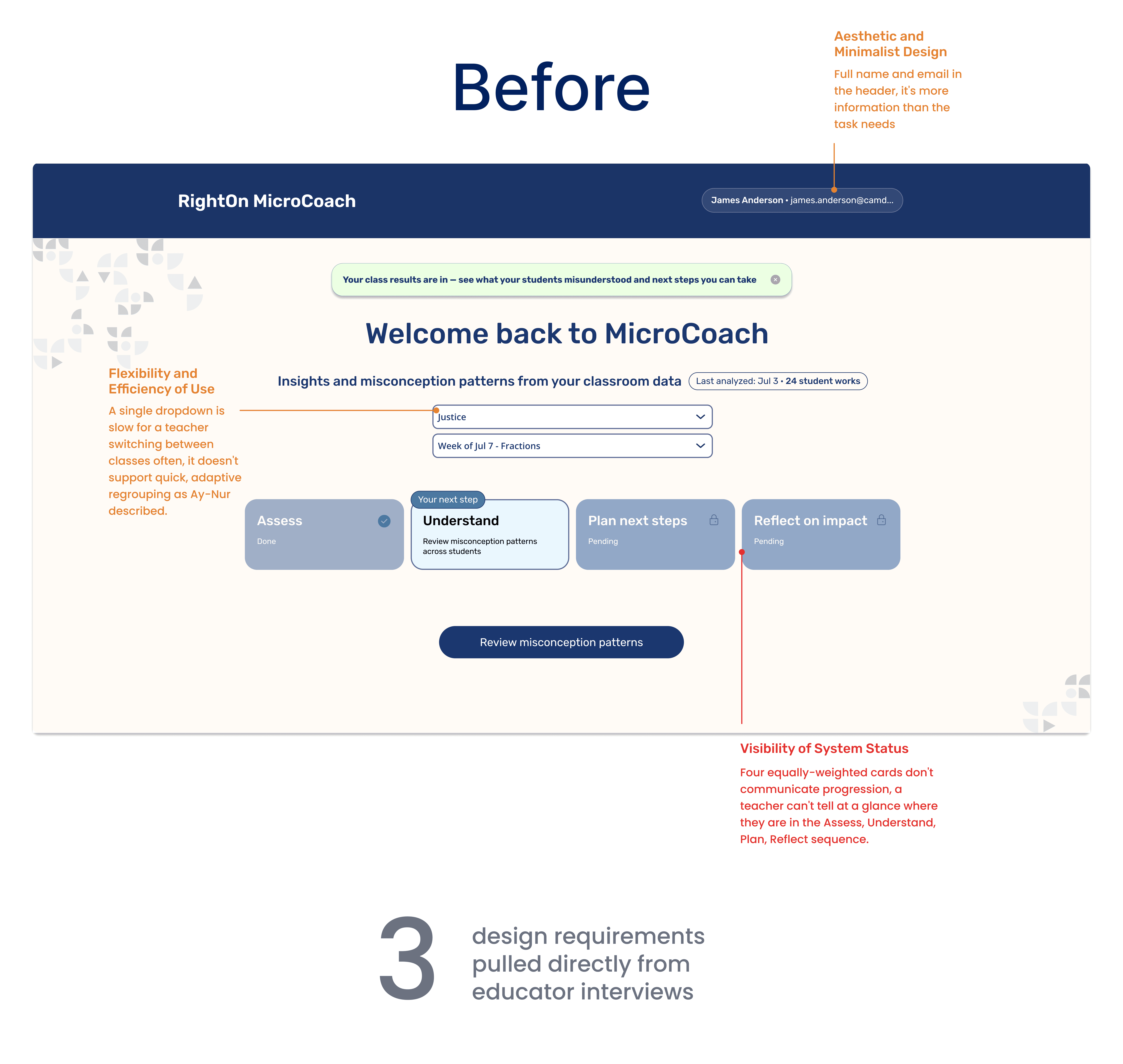
The Dashboard is where testing pushed back the hardest. Co-facilitating sessions with math educators and specialists surfaced two findings that reshaped it: Ay-Nur Najm flagged that remediation depends on reading the median student, not outliers, so the dashboard now leads with class-wide trends. Dr. Paul Chin flagged cognitive fatigue, too much AI output reads as judgment, so recommendations cap at three trends, a strengths metric sits next to the errors, and student-level detail hides behind a "view details" click.
Understand. This is one of the steps in the dashboard flow. It was shaped by input from multiple math educators, including a user interview with Ay-Nur Najm, then an AI-assisted usability review..


I built and led the design system from scratch, seven sections covering Color, Buttons, Spacing & Paddings, Typography, Dropdown, Icons, and Shadows & Overlays, documented with exact hex values, use cases, and component states for every piece so it could scale across all four MicroCoach surfaces without guesswork.
The color system itself came directly out of the landing page A/B test, where 8 of 9 testers preferred my blue system over the alternative. It was built to carry that same visual direction consistently across the whole product instead of feeling like separate screens stitched together.
Validating MicroCoach Before It Ever Reached a Teacher ✪
MicroCoach was tested at every stage by a cohort of 9 educators and researchers (S, K, AK, AC, V, Ay-Nur Najm, Dr. Paul Chin, and 2 additional teachers) across landing, upload, login, and dashboard, plus individual user interviews and a full AI-assisted usability review on top.
89% of testers preferred the final blue color system and typography, decided through a landing page A/B test
Visual Direction
A/B Testing
"Groupings are important, that's how you know who you target. But it should be flexible, a living and breathing document." — Ay-Nur Najm, user interview, July 21, 2026


What's Next for MicroCoach ꕤ。˚⋆
10 to 15 Classrooms
Target footprint: active classrooms across middle school math centers, ahead of state-level end-of-year testing
~11 participating teachers
Teacher recruitment: participating teachers lined up for early rollout
